
Published :
That’s exactly what we are attempting to do with our new user interfaces. Ironic isn’t it?
But, we think it makes sense! Why should you, as a user, spend so much time with your enterprise software? Isn’t software all about making work simpler and easier? Of course, you may fall in love with the software that you will want to use it for prolonged periods. That’s our secret agenda!
Creating mock-ups, drawing and redrawing interfaces, adding those finer touches, analyzing and testing feasibility are some of the interesting things that we, at the HCM team like to spend our time on, as we create the Next-Gen HCM product. The attention to detail that we give in creating each user interface is so much that we can say that each of them are hand-crafted!
We are spending so much time so that you spend less time in using these screens!
Here’s a simple example of a leave transaction.
Leave is one of the most frequently used ESS transactions in HCM software. We have based our UI on 2 fundamental design principles:
a) A frequent transaction should be easier and quicker to perform every time.
This means that the user, a typical employee, should have all information at one go, to apply his leave quickly. He should be pretty sure that he is making a valid leave application even before he hits ‘Save’.
b) It should be possible to carry out a frequent transaction from anywhere. The direct outcome of this is that the application should be accessible through mobile and tablet devices. That’s how the new UIs for leave transactions have evolved.
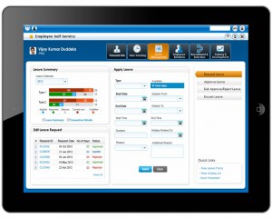
 The tablet version of the UI
The tablet version of the UI provides the required information in a single page:
Seeing the information in a single page avoids toggling between summary and transactional level information, making it easier to take decisions.
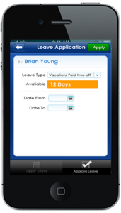
The mobile (phone) interface is designed to be ‘single finger’ navigation application: Minimal information to fill in and quick submission of information for approval. Nothing too detailed here (for a good reason!).
Our customers are one of our major influencers. We are keen that our customers find these designs intuitive and relevant for their business processes. Feedback is a critical step in our design process. So, please keep yours coming. Please let us know your thoughts through the comments section. Thanks!
Blog by: Shankar Bharathan, Principal Consultant, Ramco Systems